Japonisme Insights into Modern Painting III
モダンアート(絵画)のジャポニスム III
Underconstruction
Uploaded 2024.12.5 underconstruction
2024.10.12
André Masson (1896-1987)
A Sensitive Japonisme of Expressive Imagery and Color
Yasutaka Aoyama


Left: Masson, ‘Autoportrait Zen’, 1953, offset print on paper. Similar to Zen paintings of Daruma such as those by Hakuin (right), mid-18th century (at Manshoji Temple, Sendai).
The French painter Andre Masson, highly regarded by his artistic contemporaries from the 1920’s onward for the next half century, is today less appreciated than he deserves to be. That is perhaps partially because he fails to fall into neat categories of style, crossing the boundaries of Cubism, Surrealism and different forms of Expressionism. Thus while original in his own right, he was also an important influence upon other well-known artists such as Jackson Pollock and Joan Miró.
Endowed with a precocious gift for draftsmanship, Masson was accepted to the Académie Royale des Beaux-Arts of Brussels, although underage. As a teenager, his outstanding talent attracted the friendship and mentorship of Paul Signac and Paul Baudouin. Conscripted and then wounded in 1916 during WWI, he spent the rest of the war years in hospitals, but after the war, Daniel-Henry Kahnweiler (Picasso’s first art dealer and chief advocate for those artists associated with him), recognized his talent and encouraged his Cubism; while André Breton, impressed by his unique aesthetic sensibility and iconography, would invite him to join the Surrealists. Masson produced fine works in both, and his Surrealist automatic drawings were held in particular high regard, becoming a critical influence upon Joan Miró, whose studio was next to Masson’s.
In the 1930’s Masson moved away from Surrealism to produce more “illustrative, illusionistic works that were done in an expressionist manner” (Galeria Marc Domenech, ‘Andre Masson’, at galeriamarcdomenech.com visited 2024.10.11), and which reflect, whether wittingly or not, a kinship with Japanese ceramic design and chromatic sensibilities, which would stay with him for the rest of his life. These, along with his automatism, are considered to be an important influence upon Jackson Pollock.
During WWII he fled to America, and from the 1940’s Masson became “interested in Zen art, attempting to portray the essence of the object depicted in a spontaneous, abstract manner.” (Galeria Marc Domenech, ‘Andre Masson’, at galeriamarcdomenech.com visited 2024.10.11) Though as we mentioned above, the kinship with Japanese aesthetic sensibilities can be found early on in his works.

Masson, ‘Tristesse d’une journée de printemps’, 1955 Sand and pigments on canvas
In 1953 Masson wrote: “from the object which has now stopped oppressing me, there comes a tension that grows gradually more luminous and continues in all directions up to the edges of the pictorial surface. The lofty doctrine of Turner and the spiritual message of Zen painting have reached me.” (W. Haftmann, Painting in the Twentieth Century, Vol. 1, Lund Humphries, 1965, p. 276)

Masson, ‘Fouine prise au piège’, 1954, offset on paper
“The result” according to Werner Haftmann, in his landmark survey of modern painting, “is an almost Impressionistically fluid painting, conveying a tender, sensitive lyricism with its luminous veils of colour.” Haftmann further notes that: “His pictorial vocabulary is composed of extremely sensitive linear figures, which have the psychographic flexibility of Far Eastern ink drawings---long, dance-like, singing lines and short angular commas, set down by an automatically tracing hand, but arranged to form a coherent ornament.”


Left: Masson ‘XXe Siecle no. 38’, 1972. Right: Kato Kobei VII ‘Gosun Akae Kachomon Ozara’, latter 20th century, Japonisme Museum collection. Probably made around or possibly even after Masson’s work, it nevertheless is a typical example of the traditional style common in the Edo period, carried down from generation to generation, whose design shares something in common with that of Chagall as well.
Regarding Masson’s place in the development of abstract modern art, Haftmann writes:
“In the history of modern painting Masson is important to the extent that he helped prevent the pictorial form developed by Cubism from becoming a prison, to cut it loose from the domain of the still life within which it had been elaborated, and to fill it with a new, humanely more meaningful content, ‘the poetry of the heart’ as he once wrote. This content he found in zones of the psyche where images are born, and he strove to combine the formal insights won by Cubism and abstract painting with the new Surrealist themes.”
Haftmann concludes by placing Masson “in the same line of thinking” as Paul Klee and Joan Miro. We should add that the affinity is more than just conceptual, but also one of aesthetic sensibilities in terms of lineal and chromatic imagery, in part due to a shared, underlying awareness of Japanese art, including ceramic and folk arts, as will be argued in future discussions on this website.

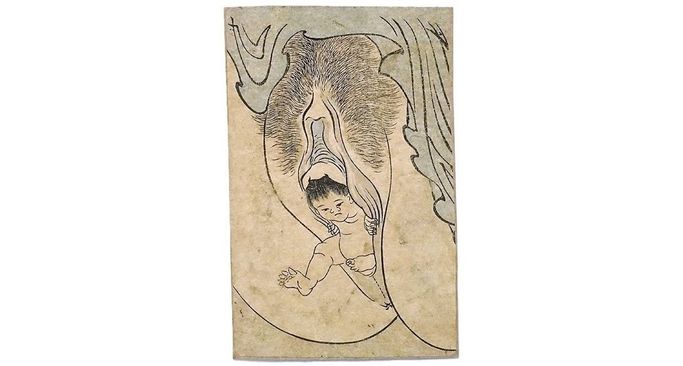
Left: Andre Masson, ‘Homme et Femme [Terre Erotique]’, c. 1948, pen and black ink on wove paper. Right: Anonymous, koban size shunga print, erotic imagery common to the late Edo period, c. mid-19th century.
________________________________________
Uploaded 2024.8.31
Japonisme Museum permanent exhibit caption card on Andy Warhol from 2021
POP ART and the Japonisme of Variation within Repetition
Andy Warhol (1928-1987)
Campbell Soup, Omocha-e and the Kyogozuri of Woodblock Prints
アンディー・ウォーホル (1928-1987)
キャンベルスープ缶やマリリン・モンロー、おもちゃ絵や色分けした校合摺
The following photo is of the Japonisme Museum exhibit of 'POP ART and the Japonisme of Variation within Repetition'. The text below is based on the exhibit caption card. Though most of the Museum exhibits are in Japanese, a few, such as the following are in English.

Above, close to ceiling, from left to right, diminutive reproductions of Andy Warhol’s 'Jack Nicklaus', golfer, who holds a hand up in the way sumo athletes in omocha-e hold their hands up; Warhol’s 'Marilyn Monroe', done in the kyogozuri style; another Marilyn with a consistent yellow backdrop like the omocha e shown below to the left. Warhol’s repeated variations over time are similar in concept to ukiyo-e sai-zuri, or woodblock reprintings with intentional variations in color and minor detail. The Japanese prints on the lower level, from left to right are '16 Kabuki Actors in Winning Roles' (歌舞伎役者十六人の当たり役, 1881); 'New Edition of Elder Sister Beauties' (新版元様美人姉さま, late 19th century); 'New Complete Edition of Sumo Wrestlers' (新板角力づくし, late 19th century). As in most cases with these types of prints, they are usually dated with publishing information, but unsigned.
The idea of color variations on a theme, such as a type of object or person, arranged in a rectangular grid as art, is one Edo to Meiji period tradition of woodblock print making, known as omocha-e, literally 'toy pictures'. Below, a collection of medals is shown (left) as an example, analogous to Warhol’s Campbell Soup Cans (below center), framed in colored rectangular blocks. Likewise, kyogozuri (below right), proof prints made from the key block in the process of ‘irowake', involving line separated color variations of the same image, are often laid out in rows and preserved as a set, looking very much like Warhol’s repetitive pictures done in intermediate color tints and tones.


_______________________
Uploaded 2021/10/14, revised 2023.9.20, 2024.5.6
Transferred from the page 'The JAPONISME MUSEUM Newsletter' 2024.8.27
December 2021
ジャポニスムの「ミクロ分析」
描法と構図をピンポイントで対比
クロードモネと歌川貞秀の作品を例に
Japonisme Micro-Analysis
Pinpointing Correspondences and Brush Stroke Details
Monet's 'L'Hotel des Roches Noires' (1870)
vs.
Sadahide's 'Totsuka' and the 'Suehiro 53 Tsugi' (1865)
Yasutaka Aoyama
The need for analysis beyond vague influence and the usual ukiyo-e artists
Claude Monet (1840-1926)'s japonisme is well discussed and documented, and we will pass over the well-known, general influence of Japanese artists in his ukiyo-e collection such as Hiroshige or Utamaro. Instead, after touching briefly on background issues of the painting in question here, L'Hotel des Roches Noires (1870), we will focus on specific similarities of motif, composition, and technique between that work and a print by the ukiyo-e artist Utagawa Sadahide (1807-1873). It will be argued that much more can be done in terms of 'micro-analysis' in japonisme research than has been attempted until now. That is to say, critical analysis can go further in identifying 'pinpoint' correspondences, such as in aspects of brush stroke detail, for instance, just as conducted in comparative academic analyses between European paintings.


Monet's painting of the seaside hotel at Trouville (shown above right), a popular vacation spot for celebrities like Flaubert and Proust, was done while he was visiting the place before leaving for London. Due to his financial difficulties however, he and his family stayed at a different hotel further away from the beach; it is said his depicting of the vacationing well-to-do there was perhaps in hidden hopes of having one of them purchase it as a souvenir of their stay.
Monet and the Suehiro 53 Tsugi (末廣五十三次), 1865
Monet's paintings in the preceding years before his 1870 'Hotel des Roches Noires', such as his 'Au Bord de l'Eau, Bennecourt' (1868), of a woman sitting near some trees at the water's edge, has been raised as an example of Japanese compositional influence, such as by Jacques Dufwa in his Winds from the East (Stockholm University, 1981). Except for generic artistic qualities considered to be 'Japanese' however, such claims are not tied to any partcular ukiyo-e work that may have served as a model.
Surely though, in regards to Monet's Bennecourt painting, a print by Sadahide from the Suehiro 53 Tsugi series, the Totsuka (戸塚) print depicting 'Kanbara' (蒲原 1865) deserves mention for its similar bold compositonal technique. Elsewhere too, in Monet's 'La Route de la Ferme Saint-Simeon, Effet de Neige' (1867), we find the composition, including the towering trees on both sides, can be profitably compared to Sadahide's 'Futagawa' (二川 1865) from the same series.
The Suehiro 53 Tsugi was a series of 53 prints by various well-known artists, including Kunisada, Yoshitoshi, and Kunichika depicting Tokugawa Shogun Iemochi's procession from Edo to Kyoto with over 3000 retainers, enroute to visit Emperor Komei. The procession's grand and flamboyant pageantry is said to have been a major event, for which people flocked to see, and is said to have greatly impressed those who beheld it. Utagawa Sadahide, one of the main contributors, did 12 prints for the series, and all show a flair for composition, often including wide open spaces or bodies of water, in combination with steeply inclined embankments or otherwise narrow valleys; while conspicuous tree branches or fluttering banners dominate the foreground, forming key compositional elements.
Sadahide was a star pupil of Utagawa Kunisada, well-known for his Yokohama-e, or pictures of Japan in the midst of westernization. But his other prints are no less significant for their artistic originality and value, especially for the study of japonisme. His 'Cinemascope' type extended vistas, his juxtaposing of various planes and objects, injected with natural elements such as wind, sun rays, or waves, must have left a vivid impression on foreign artists who saw them. Sadahide, in fact, was one of the artists the Japanese government included for the Universal Exhibition of 1867 (see 'Collection of Japanese Prints of Claude Monet' at giverny.fr). Whatever the means by which Monet might have had access to them, it seems likely that he saw several, if not the whole Suehiro series as a complete set, since other prints of the series by different artists, such as Utagawa Kuniteru's depiction of 'Fuchu' (府中), also has a red and white flag-like 'hatasashimono'(旗指物), fluttering at the very left edge of the picture, in a way very similar to Monet's flag in his Trouville hotel painting shown above.
In light of these multiple correspondences between Monet's compositions and the Suehiro 53 Tsugi series, the question arises as to if he chose the angle for the Trouville painting, as an analogous setting to that of Sadahide's, perhaps depicting the scene subtly different from the actual setting with added emphasis on the many flags, gaslights, and spires in an attempt to create a similar effect. In other words, did Monet choose to paint from that position because it reminded him of the Suehiro 53 Tsugi works he had seen, just as he and other impressionist artists have repeatedly painted a particular church or mountain in a way reminiscent of Hokusai or Hiroshige's 36 Views of Mount Fuji?
Key Points of Comparison between Sadahide's 'Totsuka' and Monet's 'L'Hotel des Roches Noires'
Sadahide's picture of Totsuka is enlived with colorful banners and playful emblems called 'hatasashimono' (旗指物) of various kinds (the red and white one with fraying ends is called a fukinuki 吹貫) which are artfully distributed in the unfolding scene of figures winding through mountains and villages, with trees towering about them, creating an intriguing composition, and shares much in common with Monet's painting of the Trouville hotel. By magnifying sections of the two pictures and juxtaposing them, key parallels in composition and concept become evident.


Similarities include the following:
1) Main subject: the dominating presence of the flag, intentionally meant to 'steal the show', so as to speak. The idea of a flag or flags as the main subject of a picture, rather than the human figures in the same picture.
2) Aspects of theme and concept: contrasting the stability of the figures below and the forceful movement of the elements subject to the wind above; the contrast between the fluttering objects above in the open sky and the dense environment below.
3) Minute detail: Monet's fluttering flag shows the sky behind it through the stripped white and red lines, as if it were also a sprayed clothe like the flag in Sadahide's print (see enlarged section of the flags from both pictures below).
4) Sadahide's red and white banner and Monet's flag both have a conspicuous object standing close to their right lower edge, the mountain top in Sadahide and the hotel's roof in Monet, both accentuating the drama of scene.
5) Interest created by the various types of pole-like objects in both pictures; Monet using gaslamps, flags, and spires which parallel Sadahide's striking variety of emblems and banners (hatasashimono) of different color, height, and shape.
6) The vertical orientation of the pictures accentuated not only by the banners, trees, or flag poles in both pictures, but with the creation on one side of each picture (left side in Sadahide, right side in Monet), of a steeply rising mass (tree on hill vs. building and its shadow), all the way to the very top of the pictures, further increasing the sense of verticality. In Sadahide branches reach up into the sky; in Monet, the rooftop ornaments fufill the same role.
7) Compositional: the placing of a tall single element (in Sadahide a tree on the right vs. in Monet the flag pole on the left), opposite the solid wall-like element, at the very edge of the picture, and beyond it is suggested an unfolding open panorama, while at the same time, once again accentuating the verticality of the pictures.
8) Compositional: The placement of buildings clustered in the central midground of both pictures, accentuating the sense of depth.
9) Aspects of perspective and forms: the paths which open wide at the front edge of the picture with lines rapidly converging inward leading toward low triangular shapes in the distance.
10) The creation of multiple levels of foreground/background by similar means: the hill in Sadahide's picture and the building shadow in Monet's both function to create a more complex sense of foreground layering, as well as the use of numerous small figures for this effect; Sadahide uses the changing mountain terrain of slopes, trees, paths; Monet uses the building and its terrace and steps, tents, shadows to similar effect in creating a layered sense of depth.
11) In Sadahide's picture, Tsuruga Bay represented by a blurred, dark navy horizontal line on the mid upper left side, far into the horizon, much like the bit of ocean visible in Monet's painting mid-left, where le Harve, his hometown is depicted vaguely in the distance, with a dark horizontal line under it (reminiscent of Sadahide's Tsuruga Bay), above the man waving his black hat.
12) Despite it being a seaside resort, the men in Monet's picture wear black hats reminiscent of the consistently black headgear in Sadahide's picture.


While we have focused on a one to one comparison of a Sadahide print and Monet painting, we should emphasize that what is found in Sadahide's Totsuka is but one example of his marvelous depictions of fluttering emblems, depictions of which can be commonly found in Japanese prints even if something strikingly unusual for Western painting. Sadahide was of course not the only one to depict these sort of feudal flags and emblems. Below is one additional example of a similar frayed flag fluttering in the wind by Utagawa Kuniteru II (1830-1874, also a contributor to the Suehiro 53 Tsugi), again juxtaposed with the flag from the same painting by Monet.


Falling under the Spell of Magnificent Daimyo Emblems
Lastly, for broader perspective, to understand the popularity of these feudal flags/emblems in Japan, and the masterful depiction of their wind blown movements by ukiyo-e artists, a few more similar prints are shown below. It is not hard to understand how Monet would have been enchanted by the variety of gorgeous tossing, twirling, and fluttering forms in these prints, especially those in the Suehiro 53 Tsugi.


Image credits: 'L'Hotel des Roches Noires' by Claude Monet is from Wikimedia Commons; 'Totsuka' by Utagawa Sadahide is part of The Japonisme Museum collection of ukiyo-e prints; 'Fuchu' by Utagawa Kuniteru II from the author's scrapbook, source lost; the last three are from the Tokyo Metropolitan Library collection.
_____________________

The Japonisme Museum, Aoyama Archives
Shogoin Sannocho 16-18, Sakyoku Kyoto 606-8392
ジャポニスム ミュージアム 青山資料館
〒606-8392 京都市左京区聖護院山王町16-18
We need your consent to load the translations
We use a third-party service to translate the website content that may collect data about your activity. Please review the details in the privacy policy and accept the service to view the translations.